Responsive Web Design: Optimizing Websites for Seamless Multi-Device Experience
In today's digital era, where users access websites on various devices, responsive web design has become essential. Responsive design ensures that websites adapt and provide an optimal viewing experience across different devices and screen sizes. By prioritizing responsiveness, businesses can deliver a seamless and engaging user experience, regardless of the device being used. In this blog, we will explore the concept of responsive web design, its benefits, and key strategies for implementing it effectively.
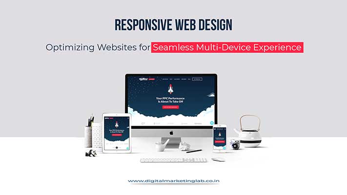
Understanding Responsive Web Design: Responsive web design is an approach that enables websites to adjust and respond dynamically to different devices and screen sizes. It involves designing and developing websites using flexible layouts, fluid grids, and media queries. Responsive design ensures that websites automatically adapt their content, layout, and navigation based on the device's screen size, providing an optimal user experience.
Benefits of Responsive Web Design:
a) Enhanced User Experience: Responsive websites provide an optimized viewing experience, eliminating the need for users to zoom, scroll horizontally, or struggle with poorly rendered content. This results in improved user engagement, increased time spent on the website, and reduced bounce rates.
b) Increased Reach: With the proliferation of mobile devices, ensuring a seamless experience across different devices expands the reach of the website. Responsive design eliminates the need for separate mobile versions of the website, making it easier to manage and maintain.
c) SEO-Friendliness: Responsive websites are favored by search engines because they provide a consistent user experience across devices. Search engines prioritize responsive design, leading to better visibility and improved search engine rankings.
d) Cost and Time Efficiency: Maintaining a single responsive website is more cost-effective and time-efficient compared to developing and managing separate websites for different devices. With responsive design, businesses can allocate resources more efficiently and streamline their web development processes.
Key Strategies for Implementing Responsive Web Design:
a) Mobile-First Approach: Designing for mobile devices first ensures that the core content and functionality are prioritized for smaller screens. This approach enables a smooth transition to larger screens and ensures a seamless experience across all devices.
b) Fluid Grids and Flexible Layouts: Implementing fluid grids and flexible layouts allows content to adapt and flow based on the screen size. This approach ensures that the website elements adjust proportionally, maintaining readability and visual appeal.
c) Media Queries: Media queries enable the website to detect and respond to different screen sizes, resolutions, and orientations. By using CSS media queries, designers can apply specific styles and layout adjustments based on the device's characteristics.
d) Optimized Images: Optimizing images for different screen sizes and resolutions helps improve website performance and load times. Using responsive image techniques, such as using the appropriate image formats and implementing lazy loading, ensures fast and efficient loading across devices.
Conclusion
Responsive web design is a crucial aspect of modern web development. By prioritizing responsiveness, businesses can provide users with a seamless and engaging experience, regardless of the device they use. Implementing a mobile-first approach, fluid grids, media queries, and optimized images enables websites to adapt to various screen sizes and deliver an optimal user experience. Embracing responsive web design empowers businesses to reach a broader audience, improve SEO rankings, and stay ahead in the competitive digital landscape.
Summary
Responsive web design ensures optimal user experience across devices, improving reach, SEO rankings, and efficiency in web development processes.